Breaking News & Updates
Xero’s financial report reveals BIG loss but share price pop. - eepurl.com/isNmKQ
My first thought when a software company changes its navigation (in a significant way) is that there were issues with the previous version.
THIS BLOG POST comes in the wake of Xero promising to improve their navigation in October 2018. Xero has now subsequently released those changes and our online support team are receiving lots of requests for help!
First and foremost, if you’re an EzyLearn student, please note that we’ve already created an update addressing the navigational updates and this is available in all of our online Xero Training Courses.
Xero is flexible, at the very least
I do want to put it out there that I have always preferred the navigation in QuickBooks Online. Why? Because you can get to all aspects of their software pretty easily.
That said, Xero is a very progressive company and they have features like Expense Management. I do think this demonstrates that Xero are continuously aiming to give business owners what they want and that’s a good thing.
What has Xero moved where?
Probably the biggest difference in the latest Xero navigation, is that accounting features are separated from the operational features of the software.
In reality, this is a very good thing. Why? Because office staff who use Xero accounting software shouldn’t necessarily have ready access to areas of Xero where they can affect the accounting side of the business.

Here are some other changes to Xero navigation:
- Xero Inventory is now called Products & Services (under the Business menu)
- Bank accounts, reports, chart of accounts, find and recode, and manual journals are now under the Accounting menu
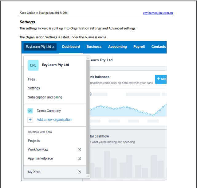
- Organisation information and settings are now under Organisation menu
- Links to the integrations that Xero now owns (like WorkflowMax and their App marketplace) are also in the Organisation menu.
Is Xero getting harder and harder to use?
It does bring up a couple other thoughts though.
- Is Xero Accounting software really beautiful the way it is?
- How will it remain beautiful when they start to implement more and more functionality?
- Is it the most beautiful of all?
New Search Feature using / (forward slash)
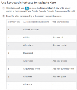
Xero now has a new search feature where you can press / (or forward slash).
Using this / feature, you can then use the following characters to jump directly to those functions.
This actually looks a lot like Lotus 123 when everyone was using DOS! (Whoops, just revealed my age, I mean, experience.)
These are the new Xero shortcut keys:
a = bank accounts
b = bills
c = contacts
d = dashboard
e = employees
i = invoices
p = purchase orders
q = quotes
r = reports
What else has Xero updated?
There are other changes to how users will be seeing information in Xero (from their website). These include the following:
- If your user role only gives you access to Expenses, you’ll only see an Expense claims menu in the navigation bar. When an Expenses role is combined with a business or accounting role, the Expense claims option shows in the Business menu.
- If you only have limited or standard access to Projects, you’ll only see a Projects menu in the navigation bar. If you have the admin role, you’ll also see a Reports menu.
Do your Xero Training Courses one at a time to save money
EzyLearn has launched our new online training course catalogue site giving you the ability to enrol in any individual training course you want — whenever you are ready. This gives you courses at individual course prices.
It’s a great option if you don’t want to pay for all levels of short courses for one price. It also means that rather than commit to an extensive TAFE course, you can upskill in Xero right now from the comfort of your own home.


